Behind the Logo
Oddly enough, despite being a creative myself, I can never really fully envision what our wedding would look like. It’s a situation where I could more or less do it for other people, but for myself I can’t. Naturally the perfectionist in me really strives to get things right which is why, entrusting a personal project like this to someone - let alone a total stranger - is something I find myself hard to grasp. It was nerve wrecking but I’ve learned to trust my planner. She found two designers to do the invitations and of course the logo of our wedding. Serendipitously, one of the designers was someone whose work I have been following since I was in college. Naturally we went with her to make our wedding logo.
Can you believe it? Weddings now have logos. Almost like launching a brand and showcasing a product during the event launch. In this case it’s quite literally a Hard Launch - lol at the Gen Z term - of Lakhi and I.
Of course if we talk about logos, you know that there has to be a story behind it otherwise you’ll typically just be creating something that doesn’t have meaning or doesn’t have a purpose other than to showcase just for the sake of it.
Like any other creative process, the general story has to come from us - the client. Lakhi and I agreed that we wanted to incorporate Indian and Filipino elements, as well as our own personal touches. I’ve gathered enough information, turned it into a collage and shared it with our designer.
I don’t really know where we were initially headed but we had to let her know that we were going for something unique. I wanted to see what she’ll create first in order for me to fully decide on what “vibe” we’re going to go for. It took her about a week and a half to give us an initial iteration of our logo but after that the whole creative process surprisingly took us 3 days. Within three days after she gave us an initial design we were able to settle on a logo.
Iteration 01-03
This was rather too decorative for my liking and it really felt traditional and a literal translation of what we wanted incorporated. It was unique but I’m glad she went out there rather than just starting off from a simple design.
Though the first iteration of the logo was out there and from this submission alone it was clear as day that I wanted our logo to be more modern and clean but still have that soft and romantic feel to it. Something that would have the right balance between decorative and minimal. I informed her that she could just get one Philippine element (say it’s flower) combined with the Mehndi as shape wise the two concepts would have curves that would go well with each other. The Solihiya could be used on the actual invitation itself but not necessarily used on the logo.
“Less decorative as much as possible. It should be a logo with a really timeless feel. It doesn’t necessarily have to outrightly say Indian and Filipino fusion at first glance.”
I told our designer that I love the 1st and 3rd Iteration. That the first one had a mix of print and script and the 3rd the logo forms an S. I also gave her the option of having a wreath incorporated on the logo. After that she made several other options, each having its own distinct rationale. From there, we had to assess if the look is too common, or something we’ve seen already every now and then, or if it’s something that matches with our personality we are while still being able to showcase the Indian and Filipino elements. There were so many factors we had to consider before settling on a certain direction.
-
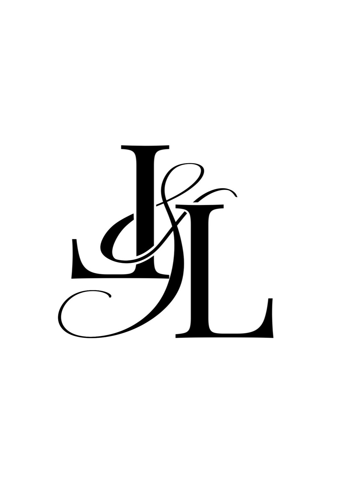
DESIGNER: “I was thinking that based on the convos, we were going for something more classic that we can apply onto anything without being theme-y. By itself it looks structured but still adds flow and curves.”
ME: “Is that an ampersand or a G?”
DESIGNER: “LL with an ampersand.”
-
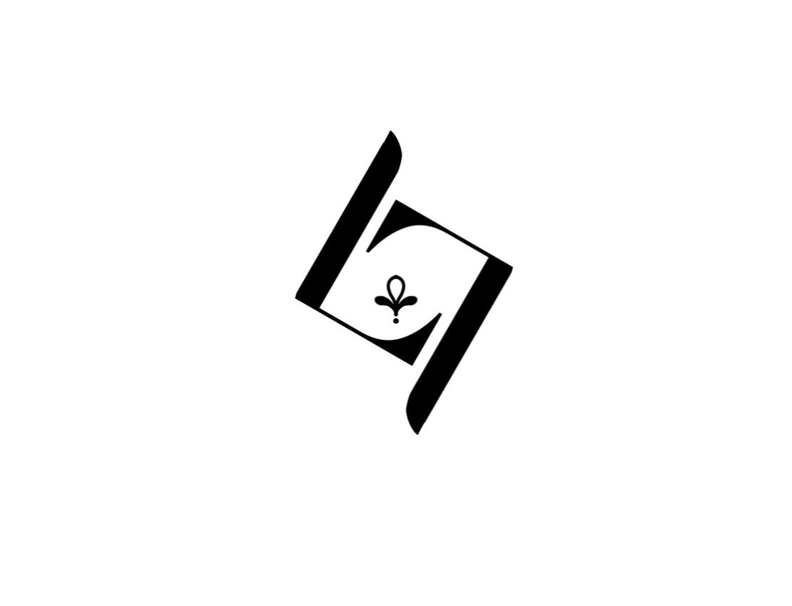
DESIGNER: “For this one, the two Ls are shaped like an S but forms a more diamond figure. It looks like the primary unit of the Mehndi. We can make this into a pattern.”
-
DESIGNER: “This gives a more bohemian modern feel. It is kind of like the Mehndi design but very linear. I also incorporated the Lotus as it’s a prominent flower among Hindus associating itself with Eternity.”
-
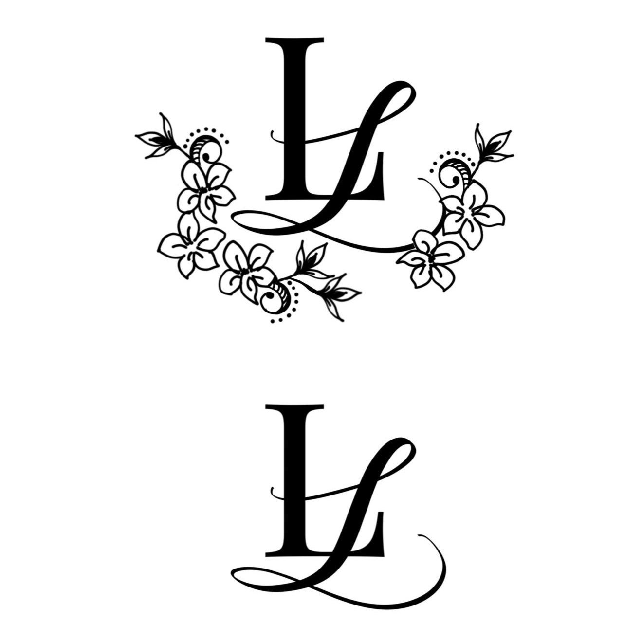
DESIGNER: “This one has wreath design on the bottom. It can be used without the wreath too. I mixed the Sampaguita with some Mehndi inspired illustrations.”
-
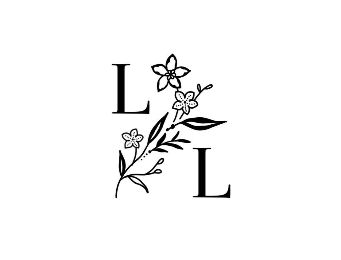
DESIGNER: “This one is just the sampaguita stem but drawn similar to the style of the Mehndi design. The content itself may not look it but the incorporation of the dots and curves of the Mehndi are present.”
From the eight (8) iterations that our designer made, we decided to explore the look of Iteration 05 more. We told our designer that we did like the simplicity of it, that the pattern and idea itself is unique. Although we did like its look, it did lack a touch of Filipino.
“Maybe we can explore putting a sampaguita flower in there and a circular border or something. Maybe try putting the lotus on the logo.”
From this point our designer made more variations of Iteration 05. We definitely could see that we’re heading in the right direction as we liked some of the designs that she made. It still needed further exploring but it definitely had that certain look. Now we needed to find something that would look good on the website and on the actual invite itself.
It is rather tricky to envision a logo especially when you’re trying to have your personality and the personality of your partner in it.
Iteration 05 Variations
Upper Left: IT5-1
Upper Right: IT5-2
Lower Left: IT5-3
Lower Right: IT5-4
From these choices Lakhi and I - as well as two of my Honors - had to really select which ones we liked out of the four of these. Lakhi liked one (IT5-4), Dana also liked one (IT5-2), and Jo liked two (IT5-3 and IT5-4). I liked all of them to be perfectly honest but then again, being a perfectionist, sometimes four variations isn’t just going to cut it. I ended up giving our designer some suggestions of what elements I wanted to add onto some of these iterations just so I could have all design options covered.
I was hoping to see a couple more variants so I decided to live edit the images she sent and send it right back to her. Keep in mind we were all just communicating via WhatsApp so live edits were such a savior for easy visual communication. Our designer gave two more iterations (IT5-5 & IT5-6).
After giving her the comment for the recent two designs, she then proceeded to make the final two iteration (IT5-7 & IT 5-8) before Lakhi and I decided on which logo we were going to go for.
The Final Iteration
Top: IT5-7
Bottom: IT5-8
For some reason I felt that it wasn’t that difficult when coming up with the wedding logo. Everything went by seamlessly. I mean I wasn’t lacking in the creative department and I think that alone made everything more seamless and efficient. I mean I wasn’t decisive, but I also wasn’t the type to keep scrapping designs left and right.
We had to decide which of the logos she presented looks best overall (for the website, the invitation, and the seal). We also had to debate about how we have to take into consideration that even if we wanted something clean and minimal, it can’t be too minimal since Indian decors are anything but that.
We ended up choosing IT5-4.
It was one of the previous iterations that looked really well on its own and the one that suits the website best. It was also the iteration that we can clearly visualize on a wax seal!
We had IT5-4 modified a bit. We decided to have the lotus filled in and placed in the center of the entire logo. Et voila! It is now the logo you see displayed here.
“I promise you Eternity”
Four (4) Sampaguita wreaths to symbolize the length of our relationship before tying the knot. Coincidentally it also signifies our age gap.
Two letter Ls forming an S (Siap) in the shape of a Diamond like the Mehndi inspiration.
The circle to signify unity.
As cheesy as it sounds the logo itself screams “wedding logo” not only because of the meaning behind it, but because of how it generally looks. We’re so happy we got a logo that was truly tailor made for us. Something that doesn’t look too decorative, too common, or too modern but pays an ode to the cultures that we are trying to fuse.


